优化一个博客网站(一):好看点。
scope/work/site roadmap/blog_site
承上
迄今为止, 我们已经完成了一个博客网站的基本搭建。 具体而言,我们有了一个根据文章 category 进行分类的简单目录, 完成了基本可读的文章样式, 设计了 404 和 contact 页面的简单样式。
从现在开始,我将把这个博客网站作为自己的主站点, 根据自己的需求, 将优化与美化的过程进行简单的记录。
你可以理解为这是一个新坑。
虽然这个新坑不会像上一个坑一样事无巨细, 但你仍然可以学习到很多东西。
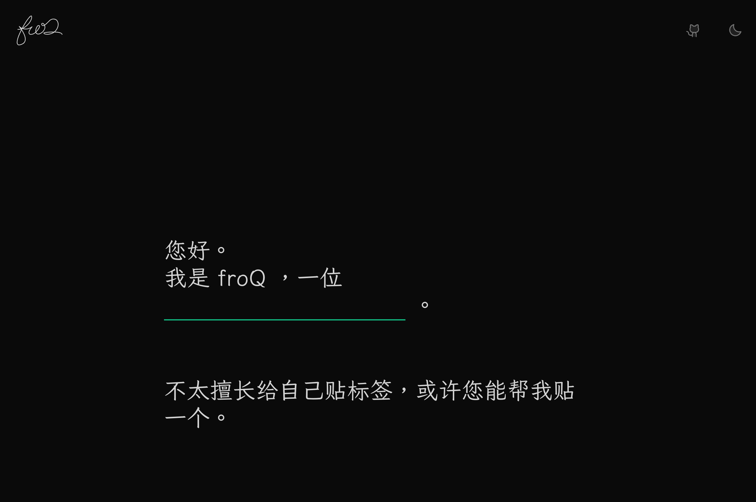
好看点
主页
沿袭一下之前扉页的设计:
这里的实现都很简单,就不多说了。
左上角的 logo 是一个带动画的 svg, 这个想法来自 Anthony Fu 的博客 Animated SVG Logo。
目录
链接
这里用到的是一个比较常规的设计。

你可以在很多地方发现相似的设计, 比如 @Innie 里面的链接。
各分类下的文章列表也采用了相似(或许是相同)的设计:
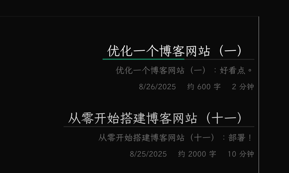
这个样式我们后续还会用到,所以把它单独抽出来做成一个组件:
<script setup lang="ts">
defineProps<{
  href: string
  text: string
}>()
</script>

<template>
  <div
    un-max-w-full
    un-inline-block
    un-duration-400
    un-relative
    un-px-2
    un-after="content-empty bg-neutral-200 dark:bg-neutral-800 w-full h-2px absolute bottom-0 left-0 z-0"
    un-before-w-0
    un-before-h-3px
    un-before-left-0
    un-before-bottom-0
    un-before-z-1
    un-before-rounded-none
    un-before-absolute
    un-hover-before-w-full
    un-before-transition-width
    un-before-content-empty
  >
    <a
      un-inline-block
      :href="href"
    >
      {{ text }}
    </a>
  </div>
</template>
随后,可以在 PageContentHome.vue 中使用它:
<template>
  <un-page-contetnt un-min-h-100vh>
    <!-- ... -->
    <div
      v-for="category in categories"
      :key="category"
      un-ml="[25%]"
      un-even="pl-10"
      un-my-10
    >
      <LinkUnderline
        :href="`#${category}`"
        :text="category"
        un-text="neutral-700 dark:neutral-300 hover:neutral-950 dark:hover:neutral-50 2xl"
        un-before="bg-rose-600 dark:bg-rose-400"
        un-italic
      />
    </div>
    <!-- ... -->
  </un-page-contetnt>
</template>
这里使用了 fallthrough attributes 来控制 LinkUnderline 中根元素的文字和下划线的样式。
好用点
进度条
对于每个 category,做了一个进度条:

讲一下具体实现。 首先,两个 div 分别作为进度条的前景和背景, 背景的宽度是 100%, 而前景的宽度通过一个内联的 --progress-bar-width 变量控制, 则我们只需要在 window 的滚动事件中更新这个变量就好了。
<script setup lang="ts">
import { onMounted } from 'vue'
// ...
onMounted(() => {
  const handleScroll = (el: HTMLElement) => {
    const categoryWrapper = el.parentElement
    if (categoryWrapper) {
      const scrollY = window.scrollY
      const wrapperOffsetY = categoryWrapper.offsetTop
      const wrapperWidth = categoryWrapper.offsetWidth
      const windowHeight = window.innerHeight

      // if the height of the category wrapper is less than the height of the window,
      // then the progress bar should be 100%
      if (categoryWrapper.offsetHeight <= windowHeight) {
        el.style.setProperty('--progress-bar-width', `${wrapperWidth}px`)
        return
      }

      const percentage = Math.min(1, Math.max(0, (scrollY - wrapperOffsetY) / Math.max(0, categoryWrapper.offsetHeight - windowHeight)))
      el.style.setProperty('--progress-bar-width', `${percentage * wrapperWidth}px`)
    }
  }

  const observer = new IntersectionObserver((entries) => {
    entries.forEach((entry) => {
      const el = entry.target as HTMLElement
      if (entry.isIntersecting) {
        // add scroll event listener when the element enters the viewport
        document.addEventListener('scroll', () => handleScroll(el))
      }
      else {
        // remove scroll event listener when the element leaves the viewport
        document.removeEventListener('scroll', () => handleScroll(el))
      }
    })
  }, { threshold: 0 }) // trigger when the element enters the viewport

  document.querySelectorAll<HTMLElement>('.title-wrapper').forEach((el: HTMLElement) => {
    observer.observe(el)
  })
})
</script>
乍一看这一坨代码,有点超雄了。 其实就是做了一个条件渲染, 仅当 categoryWrapper 可见时,才添加滚动事件。 简单的性能优化。
固定 Logo
把 logo 从 PageContentNav.vue 中拆出来, 放在 Layout.vue 中, 让它固定在顶部, 方便点击回到主页。
摘要可见性
乍一看有点密密麻麻的, 可读性略差。 可以在每个 category 下加一个切换摘要可见性的 checkbox。

这里用到了 v-model 和 v-show。 简单来说,创建了一个用于存储各个 category 摘要可见性的对象, 将 input 的 v-model 绑定到这个对象上, 再通过 v-show 来控制摘要的显示与隐藏。
文题过长
现在有一个比较丑的情况:
使用伪元素实现的下划线效果在单行文字上表现良好, 但当文字较长时, 它就会变成这种丑样子。 虽然可以通过控制标题的字数来尝试避免这种情况, 但实际很难: 首先:很显然这里标题不是等宽字体, 文本整体宽度难以精确计算, 其次,可以注意到标题中其实可能包含 markdown 标记, 目前还没有对这些标记做任何处理, 但一旦将它们都进行渲染,标题的宽度会更难以计算。
这里采用的方案是使用 text-overflow: ellipsis 来截断文字, 保证仅显示一行:
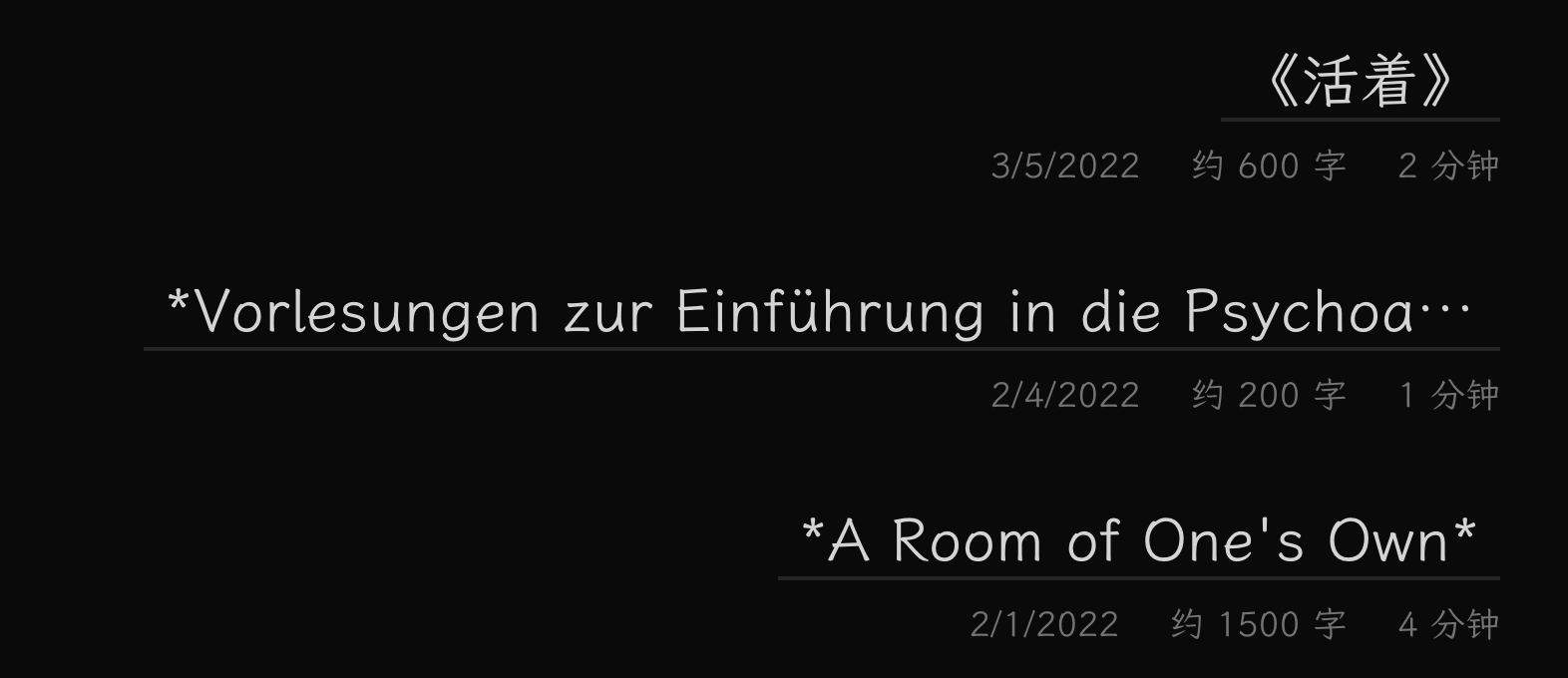
所以新的问题在于, 如何以某种其他的方式显示完整的标题以保证可读性?
简单的一个思路, 当 hover 时,用一个 tooltip 来显示完整的标题:
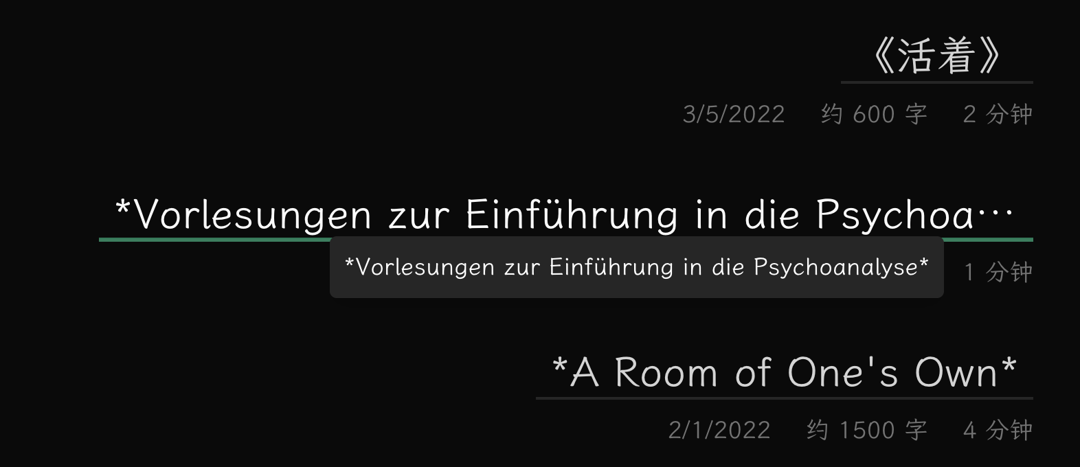
其实就是用 v-if 控制一个 div 的显示与隐藏, 不过需要注意处理超出屏幕空间的情况, 当右侧或者下方空间不足时,需要做出相应的调整。
贴一下实现:
<script setup lang="ts">
import { nextTick, onMounted, reactive, ref } from 'vue'

defineProps<{
  href: string
  text: string
}>()

const showTooltip = ref(false)
const tooltipRef = ref<HTMLElement | null>(null)
const mouseX = ref(0)
const mouseY = ref(0)
const tooltipStyle = reactive({
  left: '0px',
  top: '0px',
})

async function updateTooltipPosition(e: MouseEvent) {
  mouseX.value = e.clientX
  mouseY.value = e.clientY

  if (showTooltip.value) {
    await nextTick()
    if (tooltipRef.value) {
      const tooltipWidth = tooltipRef.value.offsetWidth
      const tooltipHeight = tooltipRef.value.offsetHeight
      const viewportWidth = window.innerWidth
      const viewportHeight = window.innerHeight

      let newLeft = mouseX.value + 10
      let newTop = mouseY.value + 10

      // Check if tooltip goes off right edge
      if (newLeft + tooltipWidth > viewportWidth) {
        newLeft = mouseX.value - tooltipWidth - 10
      }

      // Check if tooltip goes off bottom edge
      if (newTop + tooltipHeight > viewportHeight) {
        newTop = mouseY.value - tooltipHeight - 10
      }

      tooltipStyle.left = `${newLeft}px`
      tooltipStyle.top = `${newTop}px`
    }
  }
}

onMounted(() => {
  document.addEventListener('scroll', () => showTooltip.value = false)
})
</script>

<template>
  <div
    un="..."
    @mouseenter="showTooltip = true"
    @mouseleave="showTooltip = false"
    @mousemove="showTooltip = true; updateTooltipPosition($event)"
  >
    <!-- ...  -->
    <div
      v-if="showTooltip"
      ref="tooltipRef"
      class="tooltip"
      :style="tooltipStyle"
      un-text-align-start
      un-text-sm
      un-fixed
      un-z-50
      un-bg="neutral-200 dark:neutral-800"
      un-text-white
      un-p-2
      un-rounded-sm
      un-shadow-lg
      un-whitespace-nowrap
    >
      {{ text }}
    </div>
  </div>
</template>
这里 onMounted() 中的代码是为了在页面滚动时关闭 tooltip, 因为滚动时 mouseenter 事件正常触发, 而 mousemove 不会, 会导致 tooltip 出现在屏幕左上角。
mousemove 中将 showTooltip 设置为 true 是为了确保鼠标移动时始终显示 tooltip, 因为在上面的处理中, 若鼠标是通过屏幕滚动进入这个 div, showTooltip 将会被设为 false, 此时在 div 上移动鼠标时不会显示 tooltip。
甚至,把文章按年分组,再把一些文章的信息放在 tooltip 中, 界面又会简洁很多: