从零开始搭建博客网站(六):文章 Markdown 样式。
scope/work/site roadmap/blog_site
文章 Markdown 样式
简单认识 Markdown
简单来讲, Markdown 是一种标记语言, 让我们可以用一些直观的符号来标记不同的文字格式, 如使用不同数量的 # 标记标题、 使用 --- 标记一个分隔线等等。 由于 John Gruber 等人在「创造」 Markdown 时, 并没有制定具体的语法规范, 使得 Markdown 在其发展中出现了多种不同的风格。 为了在消除语法上的歧义和不一致, CommonMark 项目应运而生。 而 GitHub 在 CommonMark 的基础上, 制定了 GitHub Flavored Markdown(GFM), 以适应其社区的需求。 GFM 是 CommonMark 的严格超集。 以上二者是目前最常见的 Markdown 规范。
也就是说, 由于使用的规范不同, 加之软件自身的设计差异, 一些「小众」的语法可能并不会被所有编辑器和解析器支持。 无论如何, 这不太影响我们为绝大多数语法设计样式。
VitePress 使用 markdown-it 来解析 Markdown 语法。
先看看
在开发服务器中进入 VitePress 为我们生成的 Markdown Examples 文章, 看看在使用自定义主题的情况下它有多不可读:
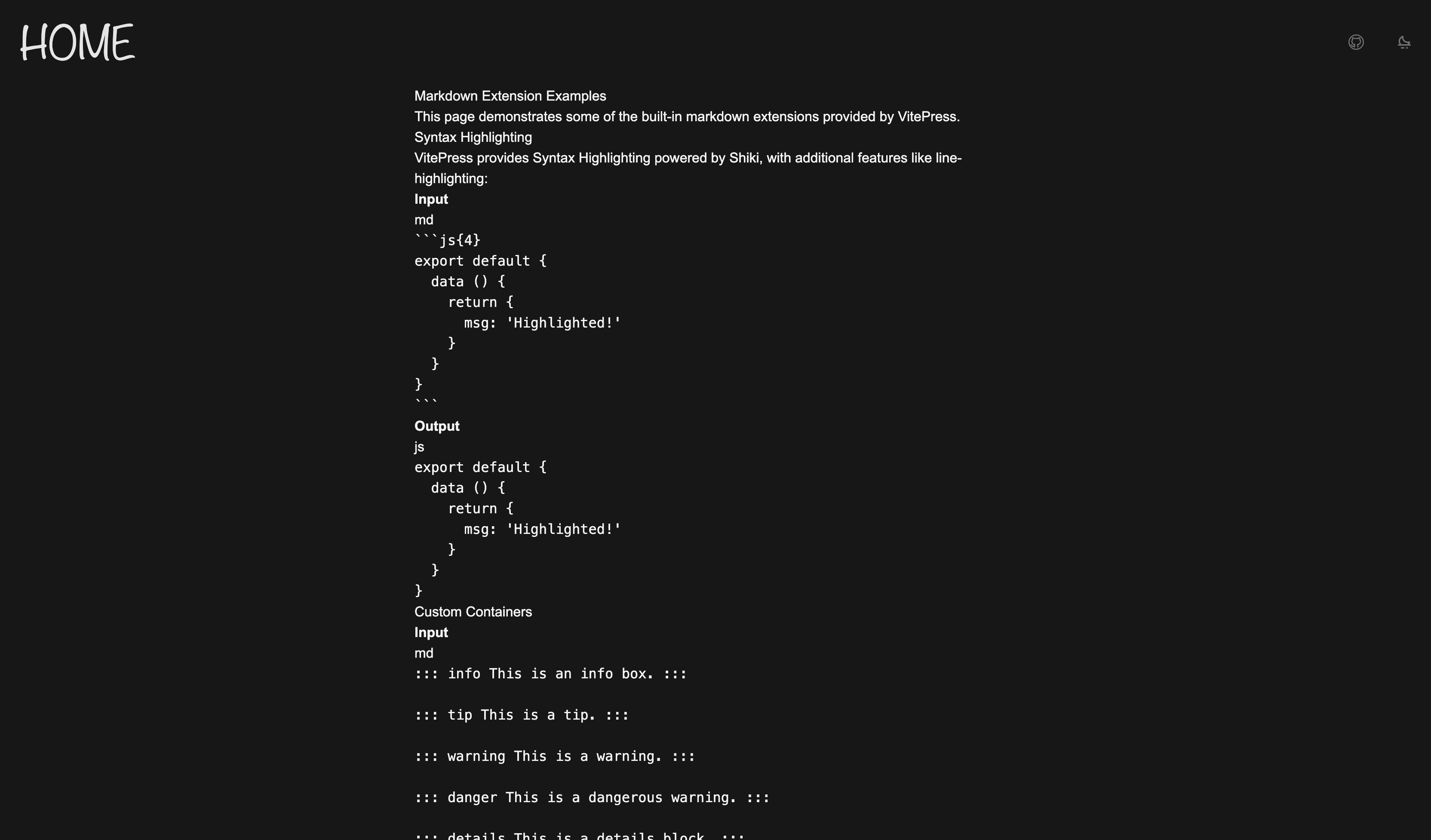
可以看到什么也看不到。
DOM
看看 PageContentPost.vue 中的结构:
<script setup lang="ts"></script>

<template>
  <Content
    id="content"
    un-max-auto
    un-max-w="[700px]"
  />
</template>
改一点结构
可以看到, 这里的页面内容只包括 Mardown 文件的内容, 没有标题。 所以稍微改一下 PageContentPost.vue:
<script setup lang="ts">
import { useData } from 'vitepress'

const { frontmatter } = useData()
</script>

<template>
  <un-page-content>
    <div
      un-my-10
      un-text="5xl/relaxed"
      un-font-serif
      un-max-w-full
    >
      {{ frontmatter.title }}
    </div>
    <Content
      id="content"
    />
  </un-page-content>
</template>
下面来逐步完成 Markdown 中常见元素的渲染。
最基本的东西
首先是字体、行距等等的基本样式:
html {
font-family: 'Hiragino Sans GB', 'Microsoft YaHei', 'Helvetica Neue', Helvetica, Arial, sans-serif;
/* smooth */
--uno: 'antialiased';
}
#content {
--uno: 'text-base/10';
--uno: 'py-10';
& p {
--uno: 'my-8';
}
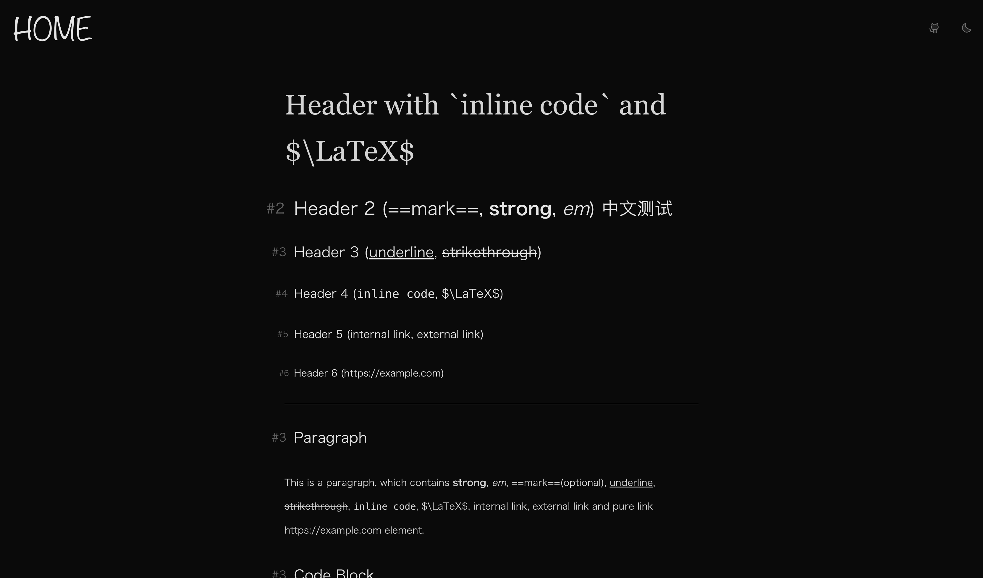
}标题
对于 1 - 6 级标题, 设置不同的字体大小; 使用 ::before 伪元素在标题前添加层级标识:
#content {
  /* ... */
  & :is(h1, h2, h3, h4, h5, h6) {
    --uno: 'my-10 px-4 w-fit relative block font-normal';
    --uno: 'text-neutral-800 dark:text-neutral-200';
    --uno: 'before:absolute before:-translate-x-[150%] before:text-[0.8em] before:opacity-40';
  }

  & h1 {
    --uno: 'text-4xl/10 before:content-["#1"]';
  }
  & h2 {
    --uno: 'text-3xl/10 before:content-["#2"]';
  }
  & h3 {
    --uno: 'text-2xl/10 before:content-["#3"]';
  }
  & h4 {
    --uno: 'text-xl/10 before:content-["#4"]';
  }
  & h5 {
    --uno: 'text-lg/10 before:content-["#5"]';
  }
  & h6 {
    --uno: 'text-base/10 before:content-["#6"]';
  }
}
看看效果:
行内元素
下面是常见的行内元素, 包括 strong、 em、 link、 inline code、 strikethrough、 underline:
#content {
  /* ... */

  /* strong */
  & strong {
    --uno: 'font-black';
    --uno: 'text-neutral-950 dark:text-neutral-50';
  }

  & a {
    --uno: 'relative inline-block text-nowrap';
    --uno: 'text-neutral-900 dark:text-neutral-100';
    --uno: 'before:content-[""] before:absolute before:bottom-0.5em before:w-full before:h-px before:bg-neutral-500';
    --uno: 'before:transition before:duration-200 after:transition after:duration-200';
    /* link icon */
    --uno: 'after:content-[""] after:i-ph-link-duotone after:inline-block after:align-middle after:ml-1 after:text-neutral-500';
    --uno: 'hover:before:bg-neutral-950 hover:before:dark:bg-neutral-50 hover:after:text-neutral-950 hover:after:dark:text-neutral-50';
  }

  /* underline */
  & u {
    --uno: 'decoration-wavy decoration-1';
    --uno: 'underline-offset-4';
  }

  /* inline code */
  & :not(pre) > code {
    --uno: 'mx-1';
    --uno: 'bg-neutral-200/50 dark:bg-neutral-800/50';
    --uno: 'text-neutral-500 dark:text-neutral-500';
    --uno: 'border border-neutral-300 dark:border-neutral-700';
    --uno: 'rounded-sm';
  }

  /* strikethrough */
  & s {
    --uno: 'text-neutral-500';
  }
}
说两个东西。 首先, 用伪元素实现链接的下划线的原因是我给 inline code 加了两侧的 margin, 而 decoration 会被 margin 切断,如下图:

且我个人认为伪元素可操作性会强一点 😃
另一个要说的是, 注意到每个标题后面都有一个链接符号, 这是由于 VitePress 处理了标题锚点链接。 这玩意可以在 config.mts 中配置。 Type declaration 在 这里。 这个功能由 @valeriangalliat/markdown-it-anchor 这个插件实现, 详细的配置方式可以访问该 repo。 这里我希望整个标题作为一个锚点链接元素, 所以我在 config.mts 中配置了如下内容:
import anchor from 'markdown-it-anchor'
import UnoCSS from 'unocss/vite'
import { defineConfig } from 'vitepress'

// https://vitepress.dev/reference/site-config
export default defineConfig({
  // ...
  markdown: {
    anchor: {
      permalink: anchor.permalink.headerLink(),
    },
  },
})
当然,需要先 pnpm install -D markdown-it-anchor。
再当然, 我们不会希望把标题应用与链接一样的样式, 所以对链接的选择器需要再改一改。 简单来说, 标题的锚点链接一定以 # 开头, 可以用这个点来区分:
#content {
  /* ... */

  & a:not(href^='#') {
    /* ... */
  }
}
代码块
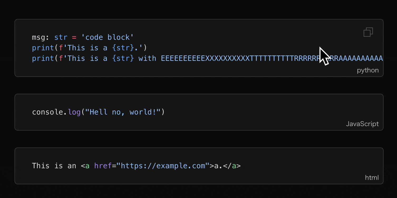
如果是作为技术博客来讲, 代码块应该是除了正文之外使用频率最高的一种元素。 VitePress 使用 Shiki 来处理代码块, 后续我们会详细讲更多关于代码块的操作。 现在先让它好看一点:
#content {
  /* code block */
  & [class^='language-'] {
    --uno: 'relative my-8 w-full';
    --uno: 'text-sm';
    --uno: 'bg-neutral-100 dark:bg-neutral-900';
    --uno: 'border border-neutral-300 dark:border-neutral-700';
    --uno: 'rounded-md';

    & pre {
      --uno: 'py-6';
      --uno: 'overflow-x-auto';

      & code {
        --uno: 'px-8 block';

        & span {
          --uno: 'text-[var(--shiki-light,inherit)] dark:text-[var(--shiki-dark,inherit)]';
        }
      }
    }

    & span.lang {
      --uno: 'absolute bottom-0 right-0';
      --uno: 'px-2 py-1';
      --uno: 'text-xs';
    }

    & button.copy {
      --uno: 'absolute top-2 right-2';
      --uno: 'px-2 py-1';
      --uno: 'text-xs text-neutral-500';
      --uno: 'hover:text-neutral-950 hover:dark:text-neutral-50';
      --uno: 'transition duration-200';
      --uno: 'before:content-[""] before:i-ph-copy-light before:block before:w-6 before:h-6';
      --uno: 'opacity-0';

      &.copied {
        --uno: 'text-emerald-500';
        --uno: 'before:content-[""] before:i-ph-check-light before:block before:w-6 before:h-6';

        &:hover {
          --uno: 'hover:text-emerald-500';
        }
      }
    }

    &:hover {
      & button.copy {
        --uno: 'opacity-100';
      }
    }
  }
}
效果如何?
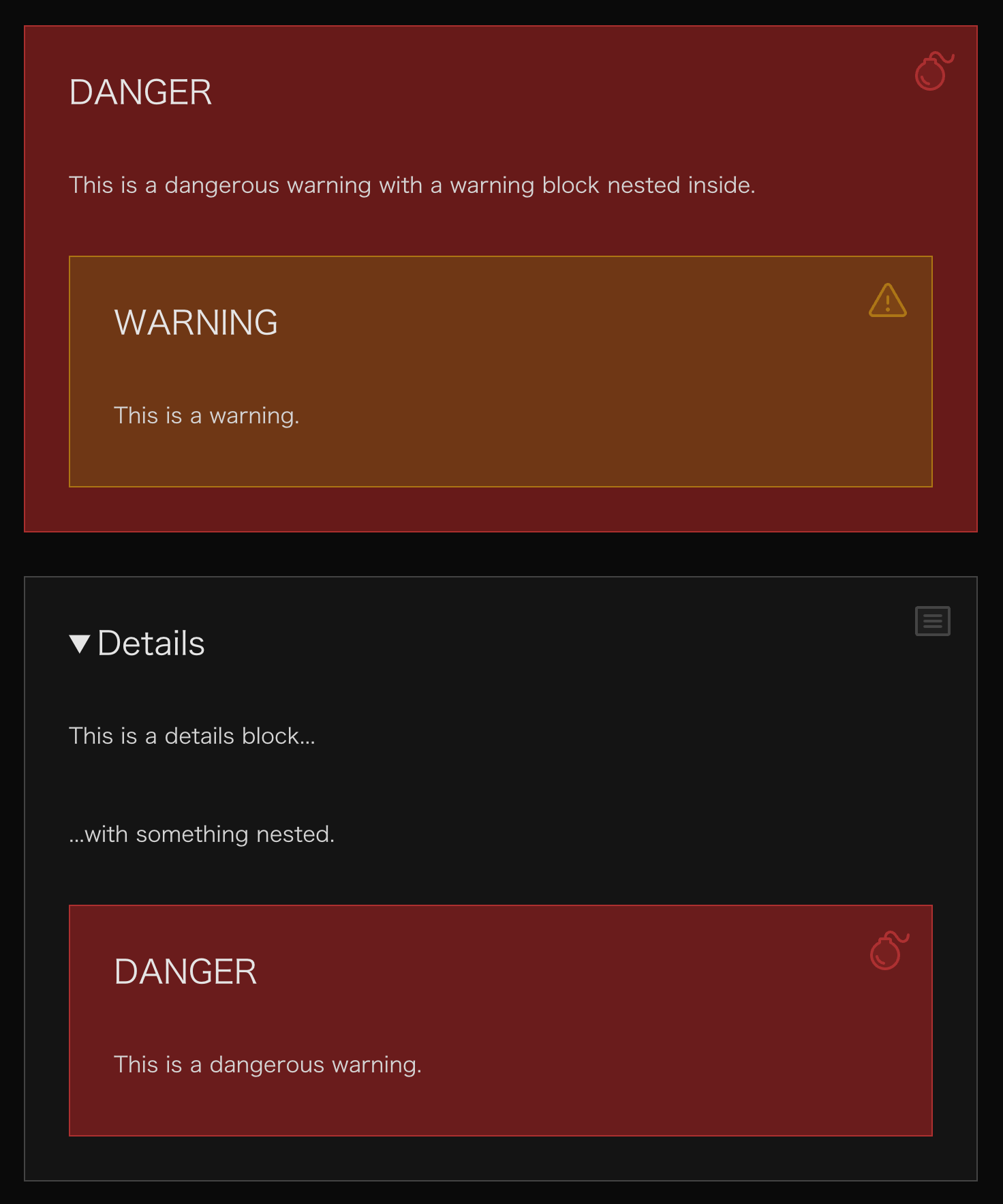
引用与自定义容器
引用块是由 > 标记的元素, 而自定义容器在这里有两种类型, 一种是形如 ::: tip 标记的 Custom Block, 另一种是形如 > [!tip] 标记的 GFM 风格 Alert。
#content {
  & blockquote {
    --uno: 'my-8 relative px-8 py-2';
    --uno: 'bg-neutral-950/5 dark:bg-neutral-50/5';
    --uno: 'border-l-4 border-neutral-500';
    --uno: 'hover:border-neutral-700 hover:dark:border-neutral-300';
    --uno: 'transition duration-200';
    --uno: 'rounded';
    --uno: 'before:content-[""] before:i-ph-quotes-duotone before:block before:w-8 before:h-8 before:absolute before:right-4 before:top-4 before:text-neutral-500';
  }

  & .custom-block {
    --uno: 'my-8 px-8 relative';
    --uno: 'before:content-[""]';
    --uno: 'before:absolute before:right-4 before:top-4';
    /* style at utilities layer to overwrite width and height set by icon below */
    --uno: 'before:inline-block before:align-middle before:layer-utilities:w-8 before:layer-utilities:h-8';
    --uno: 'before:opacity-50';

    &.note,
    &.info,
    &.details {
      --uno: 'bg-neutral-100/80 dark:bg-neutral-900/80';
      --uno: 'border border-neutral-500/50';

      --uno: 'before:text-neutral-500';
    }

    &.warning {
      --uno: 'bg-yellow-100/80 dark:bg-yellow-900/80';
      --uno: 'border border-yellow-500/50';

      --uno: 'before:text-yellow-500';
    }

    &.tip {
      --uno: 'bg-indigo-100/80 dark:bg-indigo-900/80';
      --uno: 'border border-indigo-500/50';

      --uno: 'before:text-indigo-500';
    }

    &.important {
      --uno: 'bg-violet-100/80 dark:bg-violet-900/80';
      --uno: 'border border-violet-500/50';

      --uno: 'before:text-violet-500';
    }

    &.caution,
    &.danger {
      --uno: 'bg-red-100/80 dark:bg-red-900/80';
      --uno: 'border border-red-500/50';

      --uno: 'before:text-red-500';
    }

    /* title */
    & .custom-block-title,
    & summary {
      --uno: 'my-8';
      --uno: 'text-2xl';
      --uno: 'text-neutral-800 dark:text-neutral-200';
    }

    /* icons */
    &.note {
      /* icon at layer components to have the width and height overwritten */
      --uno: 'before:layer-components:i-ph-notepad-duotone';
    }

    &.info {
      --uno: 'before:layer-components:i-ph-info-duotone';
    }

    &.details {
      --uno: 'before:layer-components:i-ph-article-duotone';
    }

    &.warning {
      --uno: 'before:layer-components:i-ph-warning-duotone';
    }

    &.tip {
      --uno: 'before:layer-components:i-ph-lightbulb-duotone';
    }

    &.important {
      --uno: 'before:layer-components:i-ph-star-duotone';
    }

    &.caution {
      --uno: 'before:layer-compoents:i-ph-siren-duotone';
    }

    &.danger {
      --uno: 'before:layer-components:i-ph-bomb-duotone';
    }
  }
}
可以注意一下里面的 layer 的用法, 由于 icon 的 rule 里面自带一个宽高为 1em 的样式, 所以如果先定义所有 icon 的宽高, 再分别设置 icon 的话, 先定义的宽高会被覆盖掉。 一种更简单的解决方案是, 把 icon 的定义放在宽高定义之前来保证 1em 被覆盖掉。
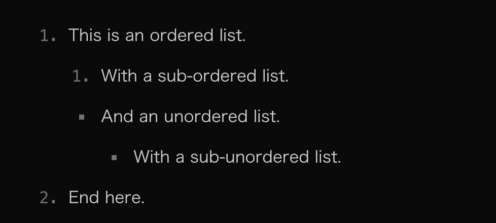
列表项
最简单的一集, 不过注意一下无序列表的符号如何与有序列表的数字对齐。
#content {
  & ol {
    list-style-type: decimal;
  }

  & ul {
    list-style-type: square;

    & li {
      --uno: '-mx-2 px-2';
    }
  }

  & ol,
  & ul {
    --uno: 'pl-8';

    & li {
      --uno: 'marker:text-neutral-500 marker:font-mono';
    }
  }
}
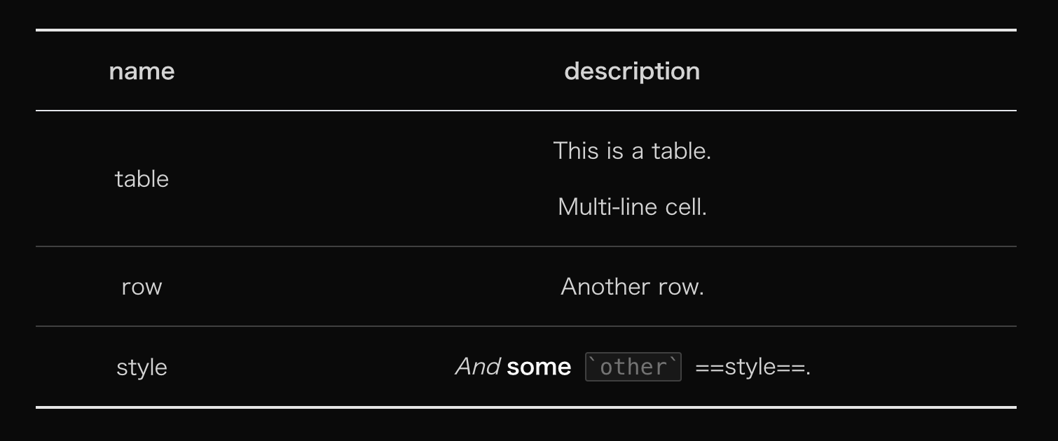
表格
表格的可操作性还是很强的, 这里在三线表的基础上把墙线加上:
#content {
  & table {
    --uno: 'my-8 w-full';
    --uno: 'border-collapse border-b-2 border-t-2';
    --uno: 'border-neutral-800 dark:border-neutral-200';

    & thead {
      --uno: 'border-b';

      & th {
        --uno: 'important:text-center';
      }
    }

    & tbody tr {
      --uno: 'border-b';
      --uno: 'border-neutral-300 dark:border-neutral-700';
    }

    & th,
    & td {
      --uno: 'p-x-4 p-y-2';
    }
  }
}
我个人喜欢把表格的标题行无脑居中, 大家自行调整。
今天到这里。